Author Archives: elliecliftlands

Little Red Riding Hood

Our final lecture this semester was on the Wolf throughout art and stories so were shown some deeply disturbing videos. One of which portrayed Santa Claus as a thief who stole people presents, ornaments and belongings, which has been done in a few different stories. This one differs in the fact that this Santa smacks a boy unconscious when he enquires as to if he is Santa and what he is doing. In this particular story Little Red Riding Hood is Santa’s daughter. The bit of the film we did see portrayed her in an over sexualised way which was a bit of a shock since I knew her from children’s programs such as Tracy Beaker and Grange Hill. LRRH goes for a walk through the city (it is not clear where) until a policeman, with a very white fake looking moustache, stops her. The policeman tries to rape her, she starts struggling, he bangs her head on the car, and she gets knocked out. The final part of the clip we see is the policeman trying to get rid of the evidence by eating her, literally! He starts eating her fingers and the blood pours from his mouth, rather unrealistically but then what part of this has been believable up until now!

poster-thumb-23901

I apologise for even mentioning this, it was so disturbing!

I am going to primarily look at Little Red Riding hood as that is a sweet innocent story about a little girl and her grandma who defeat the bad wolf in the end, or is that just how the Grimm Brothers told it.

The earliest printed version of LRRH was by Charles Perrault and was called Le Petit Chaperon Rouge. This original story has much more sinister undertones. The red hood that she wears first introduced into the tale by Perrault and the audience immediately thought of her as a harlot, the equivalent of wearing a Red ‘A’ on her clothing. This image isn’t helped by the fact that before the wolf devours her resulting in an unhappy ending, he asks her come into bed with him. At the end of the story Charles Perrault left the moral:

 ‘From this story one learns that children, especially young lasses, pretty, courteous and well-bred, do very wrong to listen to strangers, And it is not an unheard thing if the Wolf is thereby provided with his dinner. I say Wolf, for all wolves are not of the same sort; there is one kind with an amenable disposition – neither noisy, nor hateful, nor angry, but tame, obliging and gentle, following the young maids in the streets, even into their homes. Alas! Who does not know that these gentle wolves are of all such creatures the most dangerous!’

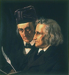
The Grimm brothers, who wrote down most of the well-loved fairy tales, were told this story as young boys but in two different versions. The first was the story that they tell in their book but the second include the LRRH and her grandmother trapping a second wolf because they learnt from the first one the way it would act. They cooked some sausages in a trough, put some water in it and put it under the chimney so the wolf would come down after smelling the sausages and drown. Its clear they kind of got a buzz out of doing this.

220px-Grimm     641h

Another slightly later telling is by Andrew Lang but it is called ‘The true History of Little Goldenhood’. This time when the wolf tried to eat her, the hood she wears burns his mouth. So she is still saved but this time not the huntsman.

Im going to move further forward now to another clip that was shown in our lecture of Little Red Riding Hood, except it is now being portrayed by Betty Boop. When we all saw this together there were a lot of child hoods ruined. When we were younger we had a vague idea of who she was and what she looked like, lots of people had her on pencil cases etc. so it was a real shock when everyone found out she was the most moronic animated character ever. It was collective shock really.

Betty is firstly warned by her ‘boyfriend’ bimbo about the wolves in the forest (bimbo is a dog, which is a bit odd to begin with but does appear in many other Betty Boop adventures). Betty is followed as usual by the wolf but this time with a knife and fork. Bimbo sees the wolf ready to attack Betty but kills the wolf just in time. Bimbo wears the wolf’s fur because he thinks that will make him more attractive to Betty. He beats her to her grandmother’s house, dresses in her clothes and waits for Betty. The usual ‘what big ears you have’ scenario happens, Betty Boop is then lifted into the air and Bimbo reveals himself and they live happily ever after. It is genuinely one of the weirdest cartoons ever seen.


I’m going to end this post on a video of a TV film called Little Red Riding hood loosely based on Roald Dahl’s version of the tale. I can’t tell you how long it took me to find this!! Probably shouldn’t have spent so long finding it but it was just a part of my child hood and couldn’t bear to miss this out! It includes Julie Walters as a mean spoilt little red riding hood and plays the grandma but this time is a horrible drunken mess (I’m getting excited just thinking about it) Once again Little Red Riding Hood beat the wolf, unaided by anyone. She just ‘whips a pistol from her knickers’ and shoots him dead.The only thing I don’t really understand is why she marries another wolf right at the end while wearing the dead wolfs fur as a new hood. The animals appear in abundance in this film. Each one has a full head mask; most are so beautiful, well made and all are wearing period costumes. The main wolf though (voiced by Danny Devito) has a full fluffy furry costume with a massive pop belly, just gorgeous. Wont go on too long about it but it is just a masterpiece. The choreography was done by Matthew Bourne, who had recently choreographed the all male production of Swan Lake.
 

Tagged , , , , , , , , , , , , ,

COMMUNICATION DESIGN CONTEXT 1:Post Modernism

Postmodernism is a term that was first used to describe new movements in architecture and then from the 1970s it started being applied to the decorative and visual arts.  It was a rebellion against the modern.

It was actually used as early as 1934 by Spanish writer Federico de Onis, and then a few years later Arnold Toynbee and others used the expression ‘post-modern’ in negative terms – they thought it was irrational reaction to modernist rationalism. The term was used occasionally until the 1970s, when it came into wider use in connection with architecture. In painting the term was more common a decade later –  in America in the mid-1980s it described art that commented strongly on the cultural values of the time.

Postmodernism challenged old ideas about art which became more free – art could be funny or absurd and was usually self aware.  Postmodern art could be contradictory and complex and broke away form the perfection earlier art aimed for: ‘If modernist objects suggested utopia, progress and machine-like perfection, then the postmodern object seemed to come from a dystopian and far-from-perfect future. Designers salvaged and distressed materials to produce an aesthetic of urban apocalypse’ (http://www.vam.ac.uk/content/articles/p/postmodernism/)

2011EU7039_arad_concrete_stereo

Ron Arad, Concrete Stereo, 1983. Stereo system set in concrete. Museum no. V&A: W.7-2011

A characteristic of postmodern art is the way it brought together industrial materials and imagery taken from pop culture and blurred the line between ‘high’ and ‘low’ art and it was often highly commercial. It was often a fusion of influences and styles and a key idea was pastiche and intertextuality.

As Wikipedia explains: ‘One compact definition is that postmodernism rejects modernism’s grand narratives of artistic direction, eradicating the boundaries between high and low forms of art, and disrupting genre’s conventions with collision, collage, and fragmentation. Postmodern art holds that all stances are unstable and insincere, and therefore irony, parody, and humor are the only positions that cannot be overturned by critique or revision. “Pluralism and diversity” are other defining features.’ (http://en.wikipedia.org/wiki/Postmodern_art#Defining_postmodern_art)

Stuart Jeffries explains that one difference between modernist and postmodernist art was what artists thought commercialism had done to the world: ‘In 1984, literary theorist Fredric Jameson wrote his essay Postmodernism, or the Cultural Logic of Late Capitalism, arguing that art had been colonised by commerce… Modernist art (think: Van Gogh transforming personal misery into beauty) sought to redeem the world, he suggested. Postmodern art (think: Jenny Holzer putting an electronic billboard over New York’s Times Square reading, “Protect me from what I want” in 1985) was made by artists stuck in a world they could scarcely change.’ (http://www.theguardian.com/artanddesign/2011/sep/20/postmodernism-10-key-moments)

holzer_protect

Jenny Holzer – The Survival Series: Protect Me From What I Want

‘Melissa Ho, assistant curator at the Hirshhorn Museum says that “Postmodern art pulls away from the modern focus on originality, and the work is deliberately impersonal. “You see a lot of work that uses mechanical or quasi-mechanical means or deskilled means,” says Ho. Andy Warhol, for example, uses silk screen, in essence removing his direct touch, and chooses subjects that play off of the idea of mass production. While modern artists such as Mark Rothko and Barnett Newman made color choices that were meant to connect with the viewer emotionally, postmodern artists like Robert Rauschenberg introduce chance to the process. Rauschenburg, says Ho, was known to buy paint in unmarked cans at the hardware store.” (http://www.smithsonianmag.com/arts-culture/Ask-an-Expert-What-is-the-difference-between-modern-and-postmodern-art.html#ixzz2lsxhYSFc )

Postmodernists made strong reference to popular culture, music, food, cinema and often embraced the kitsch…

koons_3.tif

I saw this statue by Jeff Koons in Amsterdam this summer at the Stedelijk museum. It’s a giant version of a Hummel figurine. ‘Mr. Koons insists that his kitschy works—like the super-sized, metallic Balloon Dog or the eerie, porcelain Michael Jackson and Bubbles—have no inherent, deeper meanings. He proudly holds that every individual viewer brings his or her own interpretation to his pieces, thereby rejecting the traditional role of art criticism. His distinctly postmodern mission has blurred the long-held relationships among artists, viewers and critics. ‘(http://observer.com/25th-anniversary/jeff-koons-postmodern-artist/#ixzz2lswYUnon)

01

Jeff Koons’ Pink Panther 1988 combined a semi naked statue of the actress Jayne Mansfield with a representation of the cartoon character the Pink Panther (this got Koons into trouble over copyright!)

“Representing the highest tier of Jeff Koons’ artistic achievement, Pink Panther is immediately identifiable as a masterpiece not only of the artist’s historic canon, but also of the epoch of recent Contemporary Art. It conflates the classic themes that define the artist’s output—materiality and artificiality, eroticism and naivety, popular culture and rarefied elitism—and is the model expression of one of the most innovative and influential artists of our times.”

Tagged , , , , , , ,

Communication Design Context 1: In the Pursuit of Realism: Renaissance Humanism

As I explained in an earlier post art in the middle ages was primarily used so that religion could be explained and re-enforced to people who could not read, which was the majority of people in Europe in the Middle Ages.

Renaissance Humanism was the beginning of a new way of art and imagery, which looked at humans capabilities and interests and everyday life. Religious paintings were still being created but other areas such as Greek and Roman mythology, points in history and portraits were becoming popular.

Portraits were commissioned by rich families and even though they would just be of a figure with a couple of objects, these could actually tell a whole story about the people being portrayed. Leonardo’s ‘Lady with an Ermine’ (1489-1490) is one such painting that tells us a lot about her story and that of the commissioner. Cecilia Gallerani was the mistress of Leonardo’s patron Ludovico. The painting of her was done when she was just 15 and was described by Ludovico as ‘beautiful as a flower’. Cecilia holds an ermine, which was known for its silky coat, this was usually a symbol of pregnancy; historians have presumed that Cecilia was pregnant with Ludovico’s child when this was painted. Around Cecilia’s neck is a bead necklace made of polished jet and this is thought to refer to Ludovico and his dark complexion.

The_Lady_with_an_Ermine

Paintings don’t just tell you about the subject but about the arttist, certain artists appear in their own paintings or make sure that the viewer definitely knows who the painter is.  The Arnolfini Portrait painted by Jan van Eyck, shows probably the first ever use of the phrase ‘…was here’. The mirror in the background of the portrait shows two more figures coming into the room, one of which is the painter and above it says ‘Jan van Eyck was here’.

Van_Eyck_-_Arnolfini_Portrait

18th Century-Rococo, Neo-classicism and Romanticism

Rococo comes from the French word rocaille, which is associated with fanciful decoration representing natural forms. ‘The Swing’ by Jean-Honore Fragonard is probably the most recognised painting from this movement. One of the reasons it became so famous was because of the story behind it. The lady’s elderly priest husband is pushing her while a nobleman looks up her skirts. The garter that can be seen on her lower thigh is something that really condemned  this style and painting as people wanted to forget this frivolous time. This all takes place in a flourishing garden being watched by a couple of cherubs. Two are embracing and one is shushing.

Fragonard,_The_Swing

Neo-classicism comes in at the end of the 18th century and looks back to the more classical paintings from the 15th century. At this time drawing was considered more important than painting and so when painting you had to get a smooth finish for it to be considered any good. Shading was also very important to give a clear form. It seemed that after the frivolous times in the early 18th century artists wanted to go back to story telling and a more classical subject matter.

Jacques-Louis David painted ‘The Death of Marat’ in 1793 not long after Marat’s death. The final outcome was the result of David’s personal state when seeing the body and also the physical look of Marat’s decomposing body. The composition of the painting consists of the final moments of Marat after he has just been stabbed. He was taking a bath to help with a skin condition even though in the painting he is represented to be young and healthy, apart from the fact he was dying. The objects in the painting represent what was happening at the point of the death including the knife and the petition from Charlotte Corday, the murderer. The petition said ‘My great unhappiness gives me a right to your kindness’.

Death_of_Marat_by_David

Romanticism is a movement against the Enlightenment and physical materialism of Neo-classicism and a reaction to the industrial revolution. Subject matters turned a lot darker concentrating on horror and terror.‘This room introduces Fuseli’s infamous masterwork The Nightmare. This has been an icon of horror ever since it was first exhibited to the public at the annual Royal Academy exhibition in London in 1782.’ Tate Britain.

752px-John_Henry_Fuseli_-_The_Nightmare

Obviously the picture gets moved around a lot so is also  in the DIA too.

The Pre-Raphaelites were a brotherhood set up in 1849 by William Hunt, D.G. Rossetti and John Everett Millais. They defied all the rules and conventions of art and so went against the ‘pyramidal groupings’, using conflicting sources of light and would rather use bright colours than use shadow so pictures would appear flat. The subjects of the paintings came from works by Tennyson, Keats, Browning and Shakespeare. The second stage of the Pre-Raphaelites movement was called Aesthetic Pre-Raphaelitism which introduced new members such as Ford Madox Brown and D.G. Rossetti’s sister Christina Rossetti. This new from of the brotherhood turned to the Art and Crafts Movement. This movement was then really lead by William Morris a designer of now well recognised patterns.

1280px-John_Everett_Millais_-_Ophelia_-_Google_Art_Project

Fazio

Sheperdess_HolmanHunt

Although I admit William Morris was a genius he was also an awful egotistical human being. I recently watched a program called ‘Hidden Killers of the Victorian Household’ and found that because of oil and gas lamps the middle class could have deeper and brighter wallpapers. Morris’ wallpapers were some of the best and brightest, but unknown to the Victorian families the brilliant bright green that appeared in some greens contained arsenic. Morris was told about the arsenic in his wallpapers but while denying it he owned a couple of mines full of it himself. He just blamed the customers for buying the wallpaper.

Castle_Melamine_William_Morris_Golden_Lily_Placemats_big

Tagged , , , , , , , , , ,

Communication Design Context: 1 Narrative and Narrative Image

“Evidence strongly suggests that humans in all cultures come to cast their own identity in some sort of narrative form. We are inveterate storytellers”-

Owen Flanagan, Consciousness Reconsidered, 1993

Story telling is part of our culture which has evolved over thousands of years as a way of sharing information about things that have and will happen. Storytelling is part of our development from an early age, the stories being read and told to us. Children act out stories, trying to make sense of real life situations and making the right responses. Narrative is basically a series of events that happen throughout a period of time. These stories are told through songs, poems, legends and tales and are passed down the generations. They get added to changed and embroidered but as soon as these stories got written down they become fixed and so original stories become traditional and are the stories that everyone knows.

Beowulf  has been retold for around 1500 years, it is won of the oldest stories ever to be republished. The Nowell Codex Manuscript was the work of an unknown Anglo-Saxon poet. The story of will have been changed before it was written down and it is still now being re-told in further publications and even as a film.

beowulf poster

Images of the original manuscript have now been uploaded for people to see.

beowulf manuscript

http://www.bl.uk/manuscripts/FullDisplay.aspx?ref=Cotton_MS_vitellius_a_xv 

Tzvetan Todorov the man who defined the word ‘Fantastic’ also simplified plot theory into;

Equilibrium – Everything in the story as it should be.

Disequilibrium- Everything then collapsing and disrupted.

New Equilibrium- Appears at the end of the narrative.

People have theorized the structure of a plot and this is the dramatic arc:Arc

Vladimir Propp was a scholar who first  identified in folklore and fairytales popular elements such as villainy, trickery, victory, pursuit and of course a wedding! Propp believed that the characters have a narrative function and provide a structure for the text.

gauld_lge_10

By Tom Gauld

The Bayeux tapestry is an embroidery of the  Battle of Hastings, made in Kent (kentish embroiderers were famous) and was commissioned by William II of Normandy’s, half brother Odo Bayeux. The tapestry is made of 13 sections. The story on the tapestry cut down basically starts with Harold and William meeting before the battle. Harold had crowned himself King even though William had already been offered the thrown. William was enraged so trees were knocked down to make ships in order to take knights and Horses across the sea to England. On his Arrival he built a castle and attached the local people. In the Battle of Hastings there were Norman knights fighting the Anglo-Saxon Warheads. A CRITICAL scene is when Harold appears to have an arrow in his eye but also in that frame, some would argue that we see Harold being cut to pieces. Round the boarder of the tapestry there are images of fantastical birds, fish and beasts as well as scenes from everyday life such as farming and hunting.

Harold

Religious Narrative Image

To read an image like this you have to understand her the characters are and be aware of the story. There are signs in this image that gives us a clue as to who some of these figures are. The first two who are central are obviously the Virgin Mary and Jesus as Mary is wearing white and holding an infant. The figure who seems to be in Bishop styled clothing holding a cross shaped staff is St John the Baptist and the final two figures holding the Gospels are that of St John the Evangelist and St Matthew.19247-madonna-and-child-pietro-lorenzetti Pietro Lorenzetti, The Virgin and Child and Saints, 1320

At the same time the wealthiest church goers had Book of Hours which had narrative pictures or illuminations to aid understanding and prayer. In some churches there are wall paintings which were for the lower class, some still in existence today are in the Pickering Parish Church.

stedmundmartyr1

‘Up to the end of the 15th century there were no printed books and hand written religious books that existed were rare and owned by only a few.  Thus it was not possible to learn the teachings of Christ or the lives of the saints from books.  In a small market town such as Pickering most inhabitants would also be illiterate and as the language of religious services would be in Latin they would not comprehend what was said at the high altar.’-Pickering Parish Church Website

In Catholic Churches they still have Stations of the Cross which shows Jesus Christ in his final hours often they are sculptural or 3D images.

station5

News Letter

Illiteracy was quite high at the time this came out so images were used to tell News and Events.

tumblr_mdkyqyo5uV1rhqws1o3_250

Newes from Scotland – Woodcut printed as multiples which were exchanged as news in the C16th

In the 18th century you can see relationships develop  between characters and expressions on faces in William Hogarth’s illustrations. There are six of these plates and they show the story of Moll Flanders. These images were created after they cracked down on prostitution. This first plate is the image of Moll Flanders just arriving  in Cheapside after living in the countryside seeking a job as a seamstress or a domestic servant. Mother Needham is a brothel owner and is trying to employ her, it is thought that she is being ordered by Colonel Charteris who is standing in the porch way on the right fondling himself.

Screen shot 2013-10-27 at 12.44.12

William Hogarth,A Harlot’s Progress, engraving, 1732 Plate 1: Moll Hackabout arrives in London at the Bell Inn, Cheapside.

Tagged , , , , , , ,

Communication Design Context:1 Animation origins

The earliest form of animation was found in the 1970s, it is an Iranian pot. It is dated around 2600BC and it shows 5 images of a goat trying to jump up and eat leaves on a tree. In 1825 John Paris invented the Thaumatrope, which is simply a double-sided piece of round card with a cage and one side and a bird on the other. There are bit of string that come out of the side of it and if you spin it round the bird appears to be in the cage.

Screen shot 2013-10-26 at 00.33.24

Here is a Thaumatrope I made a while ago, just managed to get the bird and the cage merging together.

In 1834 William Horner invented the Zoetrope, which gives the illusion of movement from a quick rotation of static images. The strip of images are in a metal drum which when spun you can look through the slits at the side and see the image move. In 2007 Pixar made a 3D Zoetrope inspired by one that had already been created by Studio Ghibli.

I think that the Zoetrope is the clearest explanation of animation because on the disc you get to see every frame of animation before the current frame, where you’re looking and every frame after it. – Warren Trezevant, Animator

Screen shot 2013-10-26 at 01.07.33

Charles Reynaud invented the Praxinoscope in 1877. Like the Zoetrope there is a ring of images of certain stages of an action. There is also an inner ring of mirrors, as it spins you see the reflection of the images in the mirrors. Reynaud used this invention to show the ‘cartoons’ to the public using more mirrors and a projector. After a year he patented someone to create an all in one, ‘Praxinoscope Projector’.

praxinoscopeprax

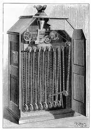
The final big movement in these ‘viewing contraptions’ is the Kinetoscope invented by Thomas Edison in 1888. The film goes round the Kinetoscope by an electrically driven sprocket wheel at the top which pins with another wheel opposite which goes through the holes at the side of the film.  This machine was used by Eadweard Muybridge to make a film of a horse running, with this he proved that horses can have all four legs off the ground at the same time when running, at this time others thought that horses always had one leg on the ground at all time.

Unknown

In 1907 James Stuart Blackton mad a film called lightening sketches. It consists of him writing a word and turning that word into the features of a mans face for example Coon:

Screen shot 2013-10-27 at 00.35.44       Screen shot 2013-10-27 at 00.36.08

This had nothing to do with actual animation but this lead him onto create another film called ‘Humorous Phases of Funny Faces‘. He used  stop-motion to show the movement of these two characters who start to pull funny faces, it is considered to be the first ever animated film. The film was released on the 6th of April 1906.

Winsor McCay created a film fr his show which was a very important movement in animation called ‘Gertie the Dinosaur‘. McCay would stand at the side of the screen and would interact and communicate with the Dinosaur. He would throw thing to it to eat so its basically interactive animation and at the end of the animation McCay would go behind the screen and would magically appear standing on top of Gertie. McCay was actually drawn in but the audience couldn’t tell. In 1918 Winsor McCay used Animation to document ‘The Sinking of the Lusitania‘, It is thought to be the first documentary animation. At that time is was not easy to take a live action camera to shoot in warfare etc.  It runs for over ten minutes and is very one sided and full of propaganda about how the Germans bombed it.

Tagged , , , , , , ,

Communication Design Context:1 Image

‘Seeing Comes Before Words’– John Berger 1972

I’m going to look at three different points in the medieval period, from 500-1500AD. The purpose for imagery comes at a time for which education and religion become more important.

Byzantine (500-1453)

Byzantine art is from the Eastern Roman Empire; Constantinople (Istanbul) was the Christian capital from 330-1450 until it was taken over by the Turkish. Byzantine art is a style, which was prominent at this time. The paintings and mosaics are flat but brightly coloured and are figurative with golden backgrounds. The byzantine art is early Christian art containing religious figures which seem to float.

image_preview

Emperor Constantine the Great was a powerful figure around this time and had many sculptures and paintings portraying him. This painting is of three figures including Jesus, Constantine the Great and Empress Zoe. I believe this painting shows that Emperor Constantine has the support of Jesus, the painting is telling the viewer to trust these two people. There are objects in this image including a book, showing he is knowledgeable and a moneybag, which obviously shows wealth. The initials either side of him stand for Jesus Christ and the blue that Jesus wears shows him to be meek and humble.

Romanesque (1000-1150)

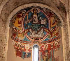
There is a symbol often used in Romanesque art called the Mandorla, it represents the union between opposites like heaven and hell and life and death. In Romanesque Christian art, Jesus sits in the middle of it and a well known version of this is in the Sant Climent de Taull.

images-2

This image shows the day of judgement with the earth under Jesus’ feet and a halo on his head.

220px-17th_century_Central_Tibeten_thanka_of_Guhyasamaja_Akshobhyavajra,_Rubin_Museum_of_Art

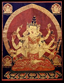
The Mandorla is also used in other religious images like this Thanga image and also in more modern images like the logo for Gucci.

images-3

orpheus

This image is ‘Christ as Orpheus’; this theme isn’t as common as the good Sheppard motif.  The image is found in the catacombs of Pete and Marcellus in Rome and date back to the 4th century. The reason Jesus is compared to Orpheus is because Orpheus had the ability to tame wild animals with song, his journey to the underworld and his brutal death. Christ is in these mythical stories so Christians warm to the stories.

The Bayeux Tapestry (1070BC)

The Bayeux Tapestry is over 70 meters long and although its called a tapestry its actually an embroidery because it has been stitched not woven. The tapestry was important because it tells us what actually happened in the battle of Hastings. The Tapestry shows over 600 men, 200 horses, 50 dogs and 3 women. As it is a story and a very long one, stylised trees break up the scenes and in the borders are fables and beasts.

bayeux-tapestry-harold-1

Gothic Art (1150-1400)

Paris_psaulter_gr139_fol1v

Parisian Psalter of Saint Louis (1253-1270)

Although this image of King David playing the harp is of the Gothic art period, a lot of its styling is that of Byzantine art. The figures have very moon shaped faces and their clothing does not have the look of linen but instead made to look a little like a mosaic. The border round the central image includes a step design, which Is also reminiscent of byzantine mosaic art.

275px-Simone_Martini_and_Lippo_Memmi_-_The_Annunciation_and_Two_Saints_-_WGA15010

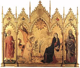
The Annunciation of Two Saints (1330-1350)

This is a wooden triptych with the figures of the Virgin Mary, Angel Gabriel, St Margaret and St Ansanus. The story is of the Angel coming to see Mary to say that she is going to have Gods son Jesus. The angel is holding an Olive branch which means peace and the Madonna lilies in the background signify purity. St Ansanus is the patron saint of Siena and is also called ‘The Baptizer’ or ‘The apostle of Siena’. He went around preaching Christianity and converted many people on his travels while being tortured and boiled on the way. The figure of St Margaret has also been identified as possibly being St Maxima who was the one who baptised St Ansanus when he was a baby. They both got tortured and St Maxima died. The realistic elements shown in the image such as the plant vase, the book and the perspective are a massive step away from the Byzantine art, which is typically flat. The arches at the top of the triptych are typically Gothic shaped with the point unlike the round Romanesque arches.

http://www.casasantapia.com/art/simonemartini/annunciations.htm

http://www.academia.edu/218054/Simone_Martini_The_Annunciation_Altarpiece_1333

Death (Gothic Art)

‘Death was at the centre of life in the Middle Ages in a way that might seem shocking to us today. With high rates of infant mortality, disease, famine, the constant presence of war, and the inability of medicine to deal with common injuries, death was a brutal part of most people’s everyday experience.’  –British Library

hellmouth-MSNerocivf39r

Damned are Swallowed by a Hellmouth (1220) is self-explanatory. The image contains one or possibly two head joined together with their mouths open. In this mouth we can see people who have sinned and horrible demons torturing and taunting them. In the image there are three kings and queens who have crowns and on the right is a monk. Around this time monks weren’t thought of very well as they were not sticking to their vows. We see to the left of the creature an angel locking them all in for eternity.

011EGE000002849U000000A0

Funeral of Lucy De Vere was written about and illustrated on a scroll along with an image of the crucifixion and the Virgin Mary with Jesus. Lucy de Vere was the head of the nunnery In Essex and when she died the 70 foot scroll got sent around to other religious houses for them to pray for her.

Tagged , , , , , , ,

Communication Design Context:1 Text/Origins of Typography

It is believed that the spoken language actually came from humans imitating animals, rather than language being sparked off. It is also thought that writing systems have been around for just as long. The start of using writing and communicative symbols was used for trading and farming. This first started in Mesopotamia; they used slabs of clay and used to scratch marks and press in tokens to create shapes. People recorded the different crops and barley was one of the most important and recorded.

ImageThis is what the Barley looked like for the first couple hundred years.
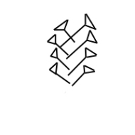
ImageThis is what it looked like when they started to use wedge shapes to create the barley symbol, it is called Cuneiform.

Image

 The rapid growth of large cities in the 4th century, prompted there to be a shared trading language, a language that a mixed population could understand.

One of the first things you think of when you hear Egypt is of course Hieroglyphs. The Egyptian’s began to develop this writing system around 3000BC. Hieroglyphs are images of animals, objects and people and you read the hieroglyphs the way that they are facing. This can be left and right but can also be written up and down. Egyptians eventually broke down the hieroglyphs into cursive writing, which is joined up writing, also known as script. Egyptians used three different forms of writing: Hieroglyphic, Hieratic and Demotic. Hieratic has been around as long as Hieroglyphs but is more of a quick hand style of writing. Demotic is the most illegible out of the three and is used to write stories and administrative texts.

ImageHieroglyphics

Image

Hieratic

Image

Demotic

A final style that starts to creep in is coptic, this is when Greek letters start to appear.

The world famous Rosetta stone was found in 1798 by some French men in a small village called Rosetta in Egypt. The locals of this town found the hieroglyphs to be impenetrable.  There are three different forms of writing on the stone; Hieroglyphs, Demotic and Ancient Greek.

 trosej

Moving on to medieval script, there are 12 different kinds such as, Carolingian Minuscule which eventually turned into a script called Blackletter. Carolingian Minuscule is standard style throughout Europe so that the literate could recognize it. It was used in Christian, Pagan and educational texts. Blackletter is also known as Gothic script and was used from early 12 hundreds to the 17th century but was used in Germany until the 20th century.

Tagged , , , , , , ,

Communication Design Context: 1 Semiotics/Semiology

Humans have always been intent on seeing meanings in things and trying to interpret signs. We interpret things as signs mostly unconsciously. Linguist Ferdinand de Saussure believes in a dyadic sign; the signifier and the signified. People believe that the ‘signifier’ is the form in which the sign takes the physical form, something which can be seen, heard, touches, smelt or tasted. Saussure thinks that the ‘signified’ and the ‘signifier’ are both psychological.

This is the images that is regularly associated with Saussure’s idea,Image

Compared to Saussure’s model, philosopher Charles Peirce’s model of semiotics is triadic. Simply it includes the symbol, icon and index.

Image

Icon- what it stands for.

ImageIndex- a sensory feature.

ImageSymbol- is doesn’t resemble what is being signified.

Something else we do is see faces in inanimate objects, this is called Pareidolia. Carl Sagan who is an astronomer, thinks that humans are hardwired to recognise faces from birth and even seeing small features from a distance. Which is probably why we see the man in the moon, there are believed to be more than just the one face. The company American express used Pareidolia to their advantaged and used numerous images of everyday objects with faces in their 2009 advert.  A cooker, chair, a computer mouse and some headphones were among the objects.

Screen shot 2013-10-01 at 15.39.24Screen shot 2013-10-01 at 15.39.39

Tagged , , , , , , ,

Communication Design Context: 1 Birth of Symbolic Language

There are over 3000-6000 spoken languages, as a species we have only had the ability to utter and make sentences as our brains have developed. We had 1.5-2.5 million years without oral communication; in that time we had to make do using gestures.

At this time we used drawings to communicate and tell stories. Some of the most famous paintings are the Chauvet Cave paintings in France. People believe that these paintings are describing not the world they live in but a more fanciful, imaginary dream world. In these paintings there are 13 types of animals including horses and lions but no humans apart from a singular female form. This appears in the ‘Salle du Fond Chamber’, ‘The Venus and the Sorcerer’.

Image

Unlike the Chauvet cave the Bhimbetka caves have human figures riding horses and are also said to tell a story of a chase. There are also singular markings, which are said to be some kind of signifying language.

The Siberian Cuneiform Script came up around 3000-1000 BC and is a semi symbolic language. This script is some of the first intensional communication carved into clay. This came up around the same time that Stonehenge would have been created; although Stonehenge is amazing this script really puts it into perspective.

Egyptian hieroglyphs are the next kind of major movement in written language. It is well known for its pictoral system instead of sound, like the alphabet. Its also different in the way that you have to read it backwards and also can look like a comic strip. In some images with hieroglyphs, it is put above the heads, a lot like speech bubbles.

11459512-egyptian-papyrus-with-antique-hieroglyphs

Tagged , , , , , , ,

Summer Project- What has gone before?

Image

Inside of front cover page

Over the summer we had to look at the history of our chosen discipline, in my case it was Illustration. For this project we had to choose a specific movement that has had an impact on the development of our discipline. For this I Chose Quentin Blake, throughout his career he actively tried to get people to start drawing and telling them that ‘they are allowed to draw’. He encourages adults and children through organizations, which are trying to abolish the phrase ‘I can’t Draw’.

The most famous and established of these organizations is ‘The Big Draw’, which helped set up in 2006 and is patron for.

Blake’s illustrations are recognizable by the expressive and flowing lines.

‘It is not about anatomical accuracy, or joining up loose lines- His characters live and breath on the page, chocka full of their personality’ – Emma Reynolds

When you think of Roalds Dahl’s books, for which Quentin did 19, the first thing you think of are his illustrations. Dahl loved having illustrations in his books, not all authors do but ‘Dahl was delighted that Matilda contained a record 100 illustrations ’.

I remember when I was a lot younger and I found a book by Quentin Blake and it basically told you how to draw but also gave you the freedom to try your own style as well as try his out. You could draw plants, umbrellas, hairy people, tall people and taught you how to draw shadows etc. It was seriously a good book. I really just remember enjoying using it and trying to copy his style, I found it difficult trying to be that free! They gave you a free pen and pencil and nothing was coming out how I wanted and as I said I was really young. As I came back to it in this project I found it so much easier. As I went through my two college years I found that I could really copy paintings. I remember when I did a Jenny Saville painting (obviously they are massive) and I had to shrink it down to a size that would fit in an A4 sketchbook and my teacher genuinely couldn’t tell which one was the painting and which was the photo! It was a real highlight I have to say. So when it came to recreating Quentin Blake I have to say it wasn’t as hard as that and adopting his style was a bit easier too. When I chose him I remembered back to when I couldn’t draw in that style at all so but I was a bit worried, as I went through the sketchbook filling it up, it just started to flow!

photo 2

photo 4

photo 5

When I really got down to drawing after researching him, I found that using pen and ink was best to get the scratching imperfect lines. Blake himself uses pen and ink but also uses all sorts of feathers as pens, fans send in feathers of strange birds for him to make into pens. On his website he has a couple of videos of him drawing paintings from books that he has illustrated, mainly his own. I just love watching him in action and how quickly he can draw a single image, but also the fact of his fame is that the image will sell easily for a couple of hundred pounds without question! I would put my favourite video of him working up on here but it ‘couldn’t be found’ so here is a link instead.

Quentin Blake’s most famous collaboration is that with Roald Dahl. At first they thought they might not have got on but with Blakes lack of ego and Dahl’s fiery personality it was a perfect match. The first couple of books were fine until they got to do The BFG and Blake was only commissioned to do the 10 drawings. “He thought I was being lazy, when in fact I was just doing what I’d been asked to do.”  Blake wouldn’t usually comment on the stories he had been given to illustrate apart from a few from revolting rhymes and a story about sleeping beauty going off with an older wizard.

tumblr_mb4tfzrS7u1qe7czqo1_500

tumblr_mb4th6nEGh1qe7czqo1_500

John Preston- The Telegraph- Quentin Blake: ‘I never wanted children. But I do invent them’ http://www.telegraph.co.uk/culture/9646192/Quentin-Blake-I-never-wanted-children.-But-I-do-invent-them..html

Tagged , , , , , , , , , ,